Update (2017): I plan on revising this article for this new website with some more current information and screenshots. Stay tuned…
After covering monitor calibration in the last newsletter, I thought it logical to go over printing this time. This one will be in Q&A form with, again, an expanded version available online here:
Q: Should I buy an dye-based printer or a pigment-based printer?
A: Unless you love super-glossy prints, I would definitely recommend a pigment-based printer like a Canon Pro 9500, Epson Photo 2880 etc. While dye-based printers will give glossier glossy prints, pigment based printers offer much greater print longevity, compatibility with the widest range of premium inkjet papers, instant drying with no colour shift and generally more accurate ICC profiles since pigment inks differ less with different paper types as far as colour response.
How much better is the longevity of prints made with a pigment based printer? Well quite a bit. For example, on glossy or semi-gloss RC-based paper stock, you can expect maybe 60+ years from a pigment printer, versus maybe several months only for dye-based under the right (well, “wrong” would be more appropriate) conditions! Dye-based inks suffer from oxidation and since most RC-based papers are essentially micro-porous crushed ceramic particles, these pores are open to air and ink can very easily oxidize. Modern pigment inks, like those from Epson, have “large” (relatively speaking) pigment particles that are encapsulated in a clear resin and this resin keeps the air away, preventing oxidation of the ink and thus colour-shifting of your prints. If you print on a PH-neutral fine-art paper without optical brighteners, you can actually expect your prints to last upwards of 200 years in some cases! For more info on print longevity testing, see the Wilhelm Research website.
Can you make somewhat “archival” prints from a dye based printer? Sort of. If you print on a PH-neutral paper as described above, your prints might last around 20 or so years. Of you print on a “swellable polymer gel” paper, a dye-based print might also last around 20 years. If you keep it dry. Swellable polymer gel papers are absolutely not waterproof. Hold a print under a tap, and you will wash the entire image away, along with the gel coating, in a matter of seconds. Contrast this with a pigment print on micro-porous paper – you can hold a print like that under warm water, scour it vigorously with your hand for minutes, then blot if off with a paper towel. You will get no ink transfer, bleeding or otherwise do any harm to your print! Well apart from scratching it maybe, if you scoured too vigorously!
What about metamerism, the tendency for a print to visually colour-shift under different light sources? You may have seen examples of this with early pigment-based printers. These days, the pigments and print drivers have been refined to the point where metamerism is almost no longer an issue at all. At least, it is not any worse on a pigment print than on a dye print or, indeed, even on some traditional RA-4 photographic papers.
Finally, what drawbacks are there to a pigment-based printer then? As mentioned above, if you really like a super-glossy looking glossy print, then a pigment printer might disappoint. Since the inks sit right on the surface of the paper, you might get some gloss differential where the ink coating is light (in the highlights) versus where it is heavier. Some papers work to minimize this, if the gloss of the paper matches the “native gloss” of the inks. For example, I find that Moab Lasal Photo Luster works very well with my Epson R2400 printer to minimize gloss differential. In fact, any of the Ultrachrome K3 ink printers from Epson work beautifully with that paper. As another example, for the most convincingly glossy prints on those printers, you should try Harman FB Gloss Al paper.
Epson does have a printer that is pigment-based, but that has a Gloss-Optimizer ink, called the Epson R1900. Basically, the gloss optimizer is a clear-coat that gets applied to your print. This minimizes gloss differential and produces the glossiest prints of any pigment printer I’ve seen. However since this printer does not have any gray inks, it is not appropriate for smooth and neutral B&W printing.
Q: Do I need to create custom ICC calibration profiles for my printer?
A: Generally, for pigment based printers, the manufacturer’s “canned” profiles work very well. Most of the paper companies we deal with (Epson, Hahnemühle, Harmon, Ilford, Moab, Museo) will provide downloadable ICC profiles for the most popular inkjet printers. I have found that the quality and consistency of these profiles is often better with pigment based printers. That said, if you would like to “roll your own” ICC profiles, it is fairly inexpensive, compared to what it once was, to buy a good printer calibration setup. For example, Datacolor’s excellent Spyder3 Print is under $600.
The benefit you have by creating you own profile, with something like the Spyder3 Print, is that you can tweak the contrast, colour-balance or even adjust the profile for the colour-temperature of the intended print viewing illumination. In addition, the Spyder3 Print allows you to create optimized toned profiles for printing B&W images. Cool tone, warm tone, mock-platinum printing, mock-cyanotype etc.
Q: How do I properly use downloaded ICC profiles?
A: First off, you need to put the profiles in the right spot on your hard drive. Usually a download will be compressed, so once you decompress the download, you will usually need to install the ICC profiles manually. For a change, this is actually easier on Windows than on Mac OS X. Once you see the “.ICC” profile, right click on it and choose “Install Profile”. That’s it. In Mac OS X, you need to navigate as follows: open your Macinotsh HD, then open the Library folder, open the ColorSync folder and the drag and drop the profiles into the Profiles folder.
If Photoshop is running, you need to quit and relaunch it, as it only scans for installed ICC profiles when it starts up. In Lightroom, you actually need to enable the profiles you want to use in the Print Module. In the Color Management section of the Print Module, you click the popup menu beside “Profile:” and choose “Other…” and then you will see a list of all the installed profiles (see screenshot below). Select the ones you want to appear in the Lightroom Profile menu. This is much nicer than Photoshop, where often you have to wade through a huge long list of profiles to get to the one you want!
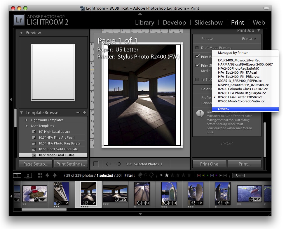
Example of Lightroom v2.3 ICC Profile Selection List
As far as rendering intent, you should use either Relative Colorimetric or Perceptual. Those are the only two choices in Lightroom but Photoshop has a few others. Different profiles may give better results with one intent versus the other. As a general rule, I’ve found that often Perceptual will give slighter higher contrast and Relative will give better shadow detail. You will need to test the two rendering intents out to determine which you like better or which is better for the type of image you are printing.
In Photoshop, the colour settings are a little more involved. In the Print Preview dialog box, you need to select “Photoshop Manages Colors” on the Color Handling menu, then choose the correct profile from the Printer Profile menu (likely scrolling through a huge long list of profiles), then choose the rendering intent as described above. Lastly, make sure the “Black Point Compensation” check-box is checked (see screenshot below). Then click “Print…” From this point onward, printing will be identical from Lightroom or Photoshop. Since Lightroom and Photoshop are by far the most common programs that photographers are using, I will not be covering any others here.

Example of Photoshop CS3 Print Dialog Box
Next will be the printer specific dialog box. It is extremely important that you obtain the proper settings for the ICC profile you are using. Generally you will either get some instructions with the downloaded profile, or there might be instructions available separately on the paper manufacturer’s site. In the print dialog, you need to select the paper type recommended for use with the ICC profile and most importantly you have to make sure that driver level colour management is turned off and that no colour adjustments are being made. Again, carefully follow the directions for the paper manufacturer’s ICC profile you are using and you should get excellent results!
A screenshot of my Epson Photo R2400 print dialog follows, which shows the correct settings for the profile shown in the above Lightroom and Photoshop dialog boxes: R2400 Lasal Luster 120507. This is a custom profile I created on December 5, 2007 (the numbers I’ve appended to the end of the profile name) for Moab Lasal Photo Luster paper. When I generated the colour-patch target prints, which were patch-read into the Spyder3 Print software to create the profile, I selected Epson Premium Photo Paper Semi-Gloss as a paper type and Color Settings were Off (No Color Adjustment).

Example of the Epson R2400 Print Dialog
Note that at the time I created the ICC profile, I had also created a preset called R2400 Lasal Photo Luster [ICC] to allow me to easily return to the exact same settings used when printing out the ICC calibration targets. This step is extremely important: you must have the driver set exactly the same way as when the original targets were printed out to generate the ICC profile. If you do not do this, then the resulting prints may not actually be accurate. This is why it is important to carefully check what printer driver settings the manufacturer of a paper recommends for any given ICC profile. If you do not get this step right, then your prints may come out looking terrible!
(more info coming soon on some of the many different inkjet paper types available!)